Typography Task 1 | Type Expression & Text Formatting
02/04/21 - 07/05/21 (Week1-Week6)
Heng Yuan Wei | 0347739
Typography | B' in Creative Media
Exercises
Task 1
Lectures
Typo 01: Development/Timeline

Figure 1.0 Boustrophedon
The Greek changed the way of writing, they developed a style of writing called "boustrophedon" (how the ox ploughs), which meant that the lines of reading text is from left to right and then right to left.
They also did not use the letter space or punctuation.

Figure 1.1 Early Letterform Development: Phoenician to Roman

Figure 1.2 Evolution of Letterform
1. Hand script from 4th - 5th century: Square Capitals

2. Hand script from 3rd- mid 4th century: Rustic Capitals


Figure 1.3 Square Capitals
- were the written version that can be found in Roman monuments
- have serifs added to the finish of the main strokes
- variety of stroke width was achieved by the reed pen held at an angle of approximately 60 degree off the perpendicular.

Figure 1.4 Rustic Capitals
3. Hand script from 4th century: Roman cursive

Figure 1.5 Roman cursive
- Every day transactions
- typically written in cursive hand in which forms were simplified for speed
4. Hand script from 4th - 5th century: Uncials

Figure 1.6 Uncials
- Incorporated some aspect of the Roman cursive hand
- especially in the shape of the A, D, E, H, M, U, and Q.
- simply as small letters
- board forms of uncials are more readable at small sizes than rustic capitals
5. Hand script from C. 500: Half-uncials

Figure 1.7 Half-Uncials
- further formalisation of the cursive hand
- mark the formal beginning of lowercase letterforms
- replete with ascenders and descenders, 2000 years after the origin of the Phoenician alphabet
6. Hand script from C. 925: Caloline miniscule

Figure 1.8 Caloline miniscule
- Charlemagne, the first unifier of Europe since Romans, issued an edict in 789 to standardise all ecclesiastical texts.
- he entrusted this task to Alcuin of York, Abbot of St Martin of Tours.
- The monks rewrote the texts using both majuscules (uppercase), miniscule, capitalization and punctuation which set the standard for calligraphy for a century.
7. Hand script from C. 1300: Blackletter (Textura)

Figure 1.9 Blackletter (textura)
- With the dissolution of Charlemagne’s empire came regional variations upon Alcuin’s script. In northern Europe, a condense strongly vertical letterform know as Blackletter or textura gained popularity.
- In the south, a rounder more open hand gained popularity, called ‘rotunda’. The humanistic script in Italy is based on Alcuin’s miniscule.
8. Hand script from C. 455: 42 line bible, Johann Gutenberg, Mainz.

Figure 2.0 42 line bible, Johann Gutenberg, Mainz
- Gutenberg’s skills included engineering, metalsmithing, and chemistry.
- He marshaled them all to build pages that accurately mimicked the work of the scribe’s hand – Blackletter of northern Europe.
- His type mold required a different brass matrix, or negative impression, for each letterform.
Typo 02: Text/Tracking: Kerning and Letter spacing
Kerning: automatic adjustment of space between letters. it often mistakenly referred to letter spacing
Letter Spacing: add space between the letters
Tracking: additional or removal of pace in a word or sentence

Figure 2.1 kerning & letter spacing

Figure 2.2 example of different tracking
1. Formatting Text

Figure 2.3 example of flush left
- Flush left: This format most closely mirrors the asymmetrical experience of handwriting. Each line starts at the same point but ends wherever the last word on the line ends. Spaces between words are consistent throughout the text, allowing the type to create an even gray value.

Figure 2.4 example of centred alignment
- Centered: This format imposes symmetry upon the text, assigning equal value and weight to both ends of any line. It transforms fields of text into shapes, thereby adding a pictorial quality to material that is non-pictorial by nature. Because centered type creates such a strong shape on the page, its important to amend line breaks so that the text does not appear too jagged.

Figure 2.5 example of flush right
Flush right: This format places emphasis on the end of a line as opposed to its start. It can be useful in situations (like captions) where the relationship between text and image might be ambiguous without a strong orientation to the right.

Figure 2.6 example of justified
Justified: Like centering, this format imposes a symmetrical shape on the text. It is achieved by expanding or reducing spaces between words and, sometimes, between letters. The resulting openness of lines can occasionally produce ‘rivers’ of white space running vertically through the text. Careful attention to line breaks and hyphenation is required to amend this problem whenever possible.
2. Texture


Figure 2.8 different typefaces
3. Leading & Line Length
- Type size: Text type should be large enough to be read easily at arms length.
- Leading: Text that is set too tightly encourages vertical eye movement; a reader can easily loose his or her place. Type that is set too loosely creates striped patterns that distract the reader from the material at hand.
- Line Length: Appropriate leading for text is as much a function of the line length as it is a question of type size and leading. Shorter lines require less leading; longer lines more. A good rule of thumb is to keep line length between 55-65 characters. Extremely long or short lines lengths impairs reading.
4. Type Specimen Book
- to provide an accurate reference for type, type size, type leading, type line length etc.
- shows samples of typefaces in various different sizes.

Figure 2.9 Type Specimen Sheets
Typo 03
1. Indicating Paragraphs

Figure 3.0 ‘pilcrow’ (¶)
- ‘pilcrow’ (¶): a holdover from medieval manuscripts seldom use today.

Figure 3.1 showing good leading
- ‘line space’ (leading*) between the paragraphs. Hence if the line space is 12pt, then the paragraph space is 12pt. This ensures cross-alignment across columns of text.

Figure 3.2 line space vs leading

Figure 3.3 standard indentation
- Standard Indentation: Typically here the indent is the same size of the line spacing or the same as the point size of your text.
2. Widows & Orphans
- widow: a short line of type left alone at the end of a column of text.
- orphan: a short line of type left alone at the start of new column.

Figure 3.4 Widows & Orphans
3. Highlighting Text
- Quotation marks: can create a clear indent, breaking the left reading axis. Compare the indented quote at the top with the extended quote at the bottom.

Figure 3.5 paragraph with quotation mark
4. Headline with Text
 Figure 3.6 A Headlines
- A head indicates a clear break between the topics within a section. In the following examples ‘A’ heads are set larger than the text, in small caps and in bold. The fourth example shows an A head ‘extended’ to the left of the text.
 Figure 3.7 B Headlines
- B head here is subordinate to A heads. B heads indicate a new supporting argument or example for the topic at hand. As such they should not interrupt the text as strongly as A heads do. Here the B heads are shown in small caps, italic, bold serif, and bold san serif.
 Figure 3.8 C Headlines
- C heads, although not common, highlights specific facets of material within B head text. They not materially interrupt the flow of reading. As with B heads, these C heads are shown in small caps, italics, serif bold and san serif bold. C heads in this configuration are followed by at least an em space for visual separation.


 Figure 3.9 Hierarchy
 - Putting together a sequence of subheads = hierarchy.

Figure 3.6 A Headlines
- A head indicates a clear break between the topics within a section. In the following examples ‘A’ heads are set larger than the text, in small caps and in bold. The fourth example shows an A head ‘extended’ to the left of the text.

- B head here is subordinate to A heads. B heads indicate a new supporting argument or example for the topic at hand. As such they should not interrupt the text as strongly as A heads do. Here the B heads are shown in small caps, italic, bold serif, and bold san serif.

Figure 3.8 C Headlines
- C heads, although not common, highlights specific facets of material within B head text. They not materially interrupt the flow of reading. As with B heads, these C heads are shown in small caps, italics, serif bold and san serif bold. C heads in this configuration are followed by at least an em space for visual separation.


Figure 3.9 Hierarchy
- Putting together a sequence of subheads = hierarchy.
4. Cross Alignment
 Figure 4.0
Cross aligning headlines and captions with text type reinforces the architectural sense of the page—the structure—while articulating the complimentary vertical rhythms. In this example, four lines of caption type (leaded 9 pts.) cross-align with three lines of text type (leaded to 13.5pts).
 Figure 4.1
- one line of headline type cross-aligns with two lines of text type, and (right; bottom left) four lines of headline type cross-align with five lines of text type.
Typo 04: Basic/Describing Letterform - Baseline: The imaginary line the visual base of the letterforms.
- Median: The imaginary line defining the x-height of letterforms.
- X-height: The height in any typeface of the lowercase ‘x’.
 Figure 4.2
Typo 05: Understanding letterform
1. Letter
 Figure 4.3 baskerville a
- The uppercase letter forms below suggest symmetry, but in fact it is not symmetrical. It is easy to see the two different stroke weights of the Baskerville stroke form (below); more noteworthy is the fact that each bracket connecting the serif to the stem has a unique arc.
 Figure 4.4 univers a
- The uppercase letter forms may appear symmetrical, but a close examination shows that the width of the left slope is thinner than the right stroke. Both Baskerville (previous) and Univers (below) demonstrate the meticulous care a type designer takes to create letterforms that are both internally harmonious and individually expressive.
 Figure 4.5 helvetica & univers "a"
- The complexity of each individual letterform is neatly demonstrated by examining the lowercase ‘a’ of two seemingly similar sans-serif typefaces—Helvetica and Univers. A comparison of how the stems of the letterforms finish and how the bowls meet the stems quickly reveals the palpable difference in character between the two.
2. Maintaining x-height
 Figure 4.6 x-height example
- describe the size of the lowercase letterforms
- keep in mind that curved strokes, such as in ‘s’, must rise above the median (or sink below the baseline) in order to appear to be the same size as the vertical and horizontal strokes they adjoin.
3. Form/Counterform
 Figure 4.7 counterform
- the space describes, and often contained, by the strokes of the form. When letters are joined to form words, the counterform includes the spaces between them.
 Figure 4.8counterform
3. Form/Contrast
 Figure 4.9 contrast letters
- The most poweful dynamic in design—as applied to type, based on a format devised by Rudi Ruegg.
- The simple contrasts produces numerous variations: small+organic/large+machined; small+dark/ large light
Typo 06: Typography in Different Medium
1. Print Type Vs Screen Type
 Figure 5.0 Print Type
- type was designed intended for reading from print long before we read from screen.
- designer’s job to ensure that the text is smooth, flowing, and pleasant to read.
- A good typeface for print-Caslon, Garamond, Baskerville are the most common typefaces that is used for print due to their characteristic which are elegant and intellectual but also highly readable when set at small font size.
 Figure 5.1 Screen Type
- Typefaces intended for use on the web are optimized and often modified to enhance readability and performance onscreen in a variety of digital environments. This can include a taller x-height (or reduced ascenders and descenders), wider letterforms, more open counters, heavier thin strokes and serifs, reduced stroke contrast, as well as modified curves and angles for some designs.
- 16-pixel text on a screen is about the same size as text printed in a book or magazine (reading distance)
- read them at arm’s length, you’d want at least 12 points, which is about the same size as 16 pixels on most screens
- System Fonts for Screen/ Web Safe Fonts: Open Sans, Lato, Arial, Helvetica, Times New Roman, Times, Courier New, Courier, Verdana, Georgia, Palatino, Garamond
Pixel Differential Between Devices:
 Figure 5.2 Pixel Differential Between Devices
1. Static vs Motion
 Figure 5.3 Static typography
 Figure 5.4 Static typography
Static Typography:
- has minimal characteristic in expressing words. Traditional characteristics such as bold and italic offer only a fraction of the expressive potential of dynamic properties.
- From billboards to posters, magazines to fliers, we encounter all forms of static typography with wide ranging purposes. Whether they are informational, promotional, formal or aspirational pieces of designs, the level of impression and impact they leave on the audience is closely knitted to their emotional connection with the viewers.
Motion Typography:
- Temporal media offer typographers opportunities to “dramatize” type, for letterforms to become “fluid” and “kinetic” (Woolman and Bellantoni, 1999). Film title credits present typographic information over time, often bringing it to life through animation. Motion graphics, particularly the brand identities of film and television production companies, increasingly contain animated type.
- Type is often overlaid onto music videos and advertisements, often set in motion following the rhythm of a soundtrack. On-screen typography has developed to become expressive, helping to establish the tone of associated content or express a set of brand values. In title sequences, typography must prepare the audience for the film by evoking a certain mood.

Figure 4.0
- Cross aligning headlines and captions with text type reinforces the architectural sense of the page—the structure—while articulating the complimentary vertical rhythms. In this example, four lines of caption type (leaded 9 pts.) cross-align with three lines of text type (leaded to 13.5pts).

Figure 4.1
- one line of headline type cross-aligns with two lines of text type, and (right; bottom left) four lines of headline type cross-align with five lines of text type.
Typo 04: Basic/Describing Letterform
- Baseline: The imaginary line the visual base of the letterforms.
- Median: The imaginary line defining the x-height of letterforms.
- X-height: The height in any typeface of the lowercase ‘x’.

Figure 4.2
Typo 05: Understanding letterform
1. Letter

Figure 4.3 baskerville a
- The uppercase letter forms below suggest symmetry, but in fact it is not symmetrical. It is easy to see the two different stroke weights of the Baskerville stroke form (below); more noteworthy is the fact that each bracket connecting the serif to the stem has a unique arc.

Figure 4.4 univers a
- The uppercase letter forms may appear symmetrical, but a close examination shows that the width of the left slope is thinner than the right stroke. Both Baskerville (previous) and Univers (below) demonstrate the meticulous care a type designer takes to create letterforms that are both internally harmonious and individually expressive.

Figure 4.5 helvetica & univers "a"
- The complexity of each individual letterform is neatly demonstrated by examining the lowercase ‘a’ of two seemingly similar sans-serif typefaces—Helvetica and Univers. A comparison of how the stems of the letterforms finish and how the bowls meet the stems quickly reveals the palpable difference in character between the two.
2. Maintaining x-height

Figure 4.6 x-height example
- describe the size of the lowercase letterforms
- keep in mind that curved strokes, such as in ‘s’, must rise above the median (or sink below the baseline) in order to appear to be the same size as the vertical and horizontal strokes they adjoin.
3. Form/Counterform

Figure 4.7 counterform
- the space describes, and often contained, by the strokes of the form. When letters are joined to form words, the counterform includes the spaces between them.

Figure 4.8counterform
3. Form/Contrast

Figure 4.9 contrast letters
- The most poweful dynamic in design—as applied to type, based on a format devised by Rudi Ruegg.
- The simple contrasts produces numerous variations: small+organic/large+machined; small+dark/ large light
Typo 06: Typography in Different Medium
1. Print Type Vs Screen Type

Figure 5.0 Print Type
- type was designed intended for reading from print long before we read from screen.
- designer’s job to ensure that the text is smooth, flowing, and pleasant to read.
- A good typeface for print-Caslon, Garamond, Baskerville are the most common typefaces that is used for print due to their characteristic which are elegant and intellectual but also highly readable when set at small font size.

- Typefaces intended for use on the web are optimized and often modified to enhance readability and performance onscreen in a variety of digital environments. This can include a taller x-height (or reduced ascenders and descenders), wider letterforms, more open counters, heavier thin strokes and serifs, reduced stroke contrast, as well as modified curves and angles for some designs.
- 16-pixel text on a screen is about the same size as text printed in a book or magazine (reading distance)
- read them at arm’s length, you’d want at least 12 points, which is about the same size as 16 pixels on most screens
- System Fonts for Screen/ Web Safe Fonts: Open Sans, Lato, Arial, Helvetica, Times New Roman, Times, Courier New, Courier, Verdana, Georgia, Palatino, Garamond
Pixel Differential Between Devices:

Figure 5.2 Pixel Differential Between Devices

Figure 5.3 Static typography

Figure 5.4 Static typography
- has minimal characteristic in expressing words. Traditional characteristics such as bold and italic offer only a fraction of the expressive potential of dynamic properties.
- From billboards to posters, magazines to fliers, we encounter all forms of static typography with wide ranging purposes. Whether they are informational, promotional, formal or aspirational pieces of designs, the level of impression and impact they leave on the audience is closely knitted to their emotional connection with the viewers.
Motion Typography:
- Temporal media offer typographers opportunities to “dramatize” type, for letterforms to become “fluid” and “kinetic” (Woolman and Bellantoni, 1999). Film title credits present typographic information over time, often bringing it to life through animation. Motion graphics, particularly the brand identities of film and television production companies, increasingly contain animated type.
- Type is often overlaid onto music videos and advertisements, often set in motion following the rhythm of a soundtrack. On-screen typography has developed to become expressive, helping to establish the tone of associated content or express a set of brand values. In title sequences, typography must prepare the audience for the film by evoking a certain mood.
Instruction
Exercises
Week 1: Type Expression
We were given 13 words that were posted on Facebook page to vote,
and choose 4 words to sketch and create design typeface. The words
that I have chosen are: Scream, Eat, Punch, and Slice.

Figure 5.5 redo-sketch for Wave and Punch (01/04/2021)

Figure 5.6 re-do sketch for Slice and Scream (01/04/2021)

Figure 5.7 re-do sketch for Eat (01/04/2021)
Week 2: Digitisation Type
After the physical doing the type expression, the next task for us to do
is digitising it. This is my first attempt on digitising type
expression after Mr. Vinod and Mr. Shamsul taught us how to digitise
it by using Adobe Illustrator:

Figure 5.8 first attempt on digitising (08/04/2021)
Before I start digitising the words, I browsed few
moment on Pinterest for some references. Here's the result:

Figure 5.9 Final Outcome for Digitisation Type Expression (15/04/2021)
For the inspiration for the "Scream" is actually came from the "big
horn", you can see the big horn shape on the "scream" words.
For "Slice", I was going to create something like all the
letters were sliced, because of my lack skilled in Adobe
Illustrator, I couldn't create the effect that I wanted,
so I think of another ways and search from Pinterest and
Google.
For the "Eat", is basically a "E" eating the other two letters,
"a" and "t".
For the principle of the "Punch" is just the letter "P" punching the
others letter.
- Final Outcome
Week 3: Animation Type
After some explorations, "Punch" is chosen for animating, this is the
result:
- Final Outcome
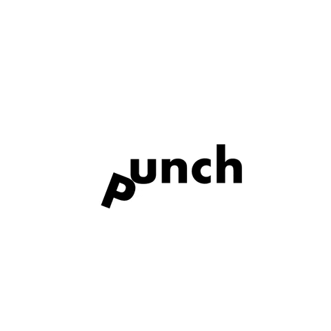
figure 6.0 Final Outcome Type Expression Animation for "Punch"
(20/04/2021)
Week 4: Text Formatting
This week, we learned about Font Size, Line Length, Leading,
Paragraph Spacing, Baseline Grid and so on.
Things to be noted:
Font size: 8 to 12 pt
Line Length: 55-65 characters
Paragraphs spacing = Leading (2x pt bigger than font size) "depends"
Ragging: should not exceed 3 times (left/right)
Headline: 2x bigger than font size and leading

figure 6.1 First try on Text Formatting (28/04/2021)
After receiving the feedback from classmate, I have made some changes on
the alignment of the headline and ragging and kerning of text:

figure 6.2 Final Layout (29/04/2021)

figure 6.3 before and after (29/04/2021)
- Font size: 9 pt
- Line Length: 62 characters
- Paragraphs spacing/Leading: 14pt
- Final Outcome

figure 6.4 Final Outcome (29/04/2021)
FEEDBACK
Week 2
Questions asked:
1. Are the explorations sufficient?
2. Does the expression match the meaning of the word?
3. On a scale of 1–5, how strong is the idea?
4. How can the work be improved?
Specific Feedback:
Have to redo it and do more explorations.
General Feedback:
The idea for the word lack of exploration, there is
only 2 words that matched the expression which are "slice and wave". My
friends rated my type expression sketches 3.5 over 5.
Week 3
Questions asked:
1. Do the expressions match the meaning of the words? Yes
2. Are the expression well crafted (crafting/lines/shapes)? Yes
2a. Do they sit well on the
art-board Yes
2b. Are the composition engaging?
Impactful? Yes
3. Are there unnecessary non-objective elements? No
4. How can the work be improved?
Improve the letter "c" in scream word, as it is overly
distorted
Specific Feedback:
Mr.Vinod said that the letter "c" in "scream" is overly distorted but
beyond that, the others is fine and he think that the "Eat" is interesting
and he like that the way I did a little bit distortion, punch works as
well as slice too.
Week 4
Specific Feedback:
For E-portfolio, change name to full name instead of
nickname, and write date for each picture. For animated type, could be do
better, the letter "p" and "unch" didn't really planed that well.
General Feedback:
make improvement to that animation "punch", make it
smoother.
Week 5
Questions asked:
1. Is kerning and tracking appropriately done?
2. Does the font size correspond to the line-length, leading &
paragraph spacing
3. Is the alignment choice conducive to reading?
4. Has the ragging been controlled well?
5. Has cross-alignment been established using base-line grids?
6. Are widows and orphans present?
Specific Feedback:
change the two paragraphs that only have 1 word to 2
or may be 3, and adjust the leading, edit the ragging and make the
headline same line with the two columns.
General Feedback:
There is two lines that only consists 1 word,
headline is not same line with the columns, first paragraph look
justified and the others not.
REFLECTION
Experience: I was very anxious every Friday before the class started, but then I realised when I listening to the lectures and when Mr.Vinod and Mr.Shamsul taught us how to create unique type, I have no time to get anxious about it. When the lecturers required us to do the type digitising on Adobe Illustration, I was a bit worried as I was not familiar with it, the previous designs that I did when I was a freelancer graphic designer were done by Adobe Photoshop. However, before we start any design, the lectures will do a demo for us to learn. And the way Mr.Vinod and Mr.Shamsul taught us, will never let me get sleepy as there are a lot of step and thing that have to be jotted down and noticed.
Observations: I found that doing sketches is important part when anything get started, once sketches couldn't done well, the works will definitely not going very smooth and fast. By the way, I never know that typography can be so in-depth at the first time, but overall it was very interesting and fun.
Findings: After 5 classes of typography, I gained bunch of knowledges and all of them are very interesting and useful, I can use those skills at another subjects also. I also think that documenting our work process and all the stuff at blogspot are very important as we can look back to see if we have improved throughout the whole studies.
FURTHER READING

figure 6.5 Typographic design: Form and communication.


Comments
Post a Comment